It could’ve been the death of my father or just the realization that the man staring back at me in the mirror was no longer the embodiment of youth, but whatever the reason: a little over a year ago, I set out to do some serious thinking about my art and how I make it.
For as far back as I can remember, I knew that I’d be an artist. That’s what everyone told me I would be. But what kind of artist: animator, sculptor, or illustrator? I wasn’t sure. All I knew was that I liked to tell stories and I wanted to tell stories; stories with meaning, but most importantly, stories with feeling.

When I first settled on painting I really knew very little about it. The most important thing for me, at first, was to create easily readable and emotionally charged pictures. But over time, as I refined the way I presented my narratives, I thought that on a certain level the images felt flat. I felt that how I used the paint was “unconvincing”. For example, black paint was my stand in for all things in shadow and white paint was used the same way for all things in light.
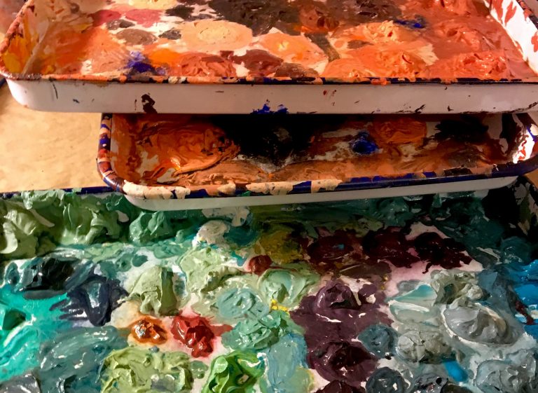
As I began to wrestle with these ideas I realized something about the complexity of color: using color is about much more than the literal translation presented to us on a box of crayons; think of sky blue, brick red, and lemon yellow. Grass may be many combinations of yellows, reds, blues and whites. And for most of us, how we assign color to an object depends on what we think the object “is”, and what color it is supposed to be — grass is green. What I now see, because I stared at it long and hard enough, is that the degree and tone of light on an object changes the color we perceive it to be, and, even more importantly for me as a storyteller, how we feel about it.
At the same time, I realized that what a painting is about, the stories I tell in the traditional sense, isn’t what I most care about. I want my stories to be less tangible. They should be open-ended, and evoke a feeling. Through a smarter use of color I hope to create images that invite the viewer to not just look, but experience the moment depicted on canvas.
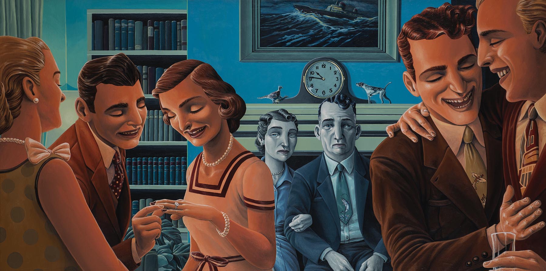
So I began to study color theory in earnest, practicing what I learned along the way. And after doing a number of paintings implementing the things I was learning, I recently completed what I consider to be a breakthrough. When I first made sketches of “The Engagement” two years ago, I thought of it as a simple story about family. But armed with new ideas on color, I decided to try a simple color experiment using complimentary colors. I arbitrarily assigned a blue palette for the background of the painting and an orange palette for the foreground. And in doing so, the story became much more compelling. Using only variations of blue, I began painting as I always do: in layers, starting from the background while moving forward as if I was a camera on a dolly, slowly overlapping forms. First the background wall, then the painting in frame, then the books and bookshelf, then the clock and decorations, then the mantle, and then the older couple.

When I began to paint with the orange palette in the foreground I started to understand that the contrast between the older couple in the background bathed in cool tones, and the young people in the foreground in warm tones, turned this simple story about family into a fuller story with more nuance and possibility. It was, therefore, a more realistic story.
I don’t think that this painting is somehow the definitive moment when I figured out how to tell the perfect story, but I can say that I think it’s an example of how I’ve learned to use color more effectively to create stories that depict and explore the raw, messy, and seemingly unimportant moments in life (that really say so much about us all.)
Currently I’m continuing my exploration of color and narratives as I plan and create a new body of work for a solo show opening in November at the Adah Rose Gallery in Kensington, MD. I hope you’ll come see the work.
 Gregory Ferrand received a degree in film from Virginia Commonwealth University in 1997 and promptly headed off to Buenos Aires, Argentina to teach English to business people. While living there he kept an illustrated journal in which he experimented with different media and recorded his observations about the culture and people around him. In doing so, he came to understand two things about himself: 1. that he was a painter and 2. that he was fascinated by the subtext of human interactions. He returned to the States in early 2000 and began painting seriously.
Ferrand pulls on influences as wide ranging as comics, Mexican muralists, and 1950’s fashion to create paintings that reveal the beauty of living. His background in film is evident in the strong use of narrative he employs to tell stories about characters and situations that do, have, and will exist; gently unmasking the psychological or emotional state of the subject, inviting the viewer to share and/or identify.
His works have been shown locally at Emerson Gallery at the McLean Project for the Arts, Hillyer Art Space, and the Adah Rose Gallery among others. Clients include Saatchi and Saatchi, American Airlines, Cava Mezze Restaurants, and the Mosaic Theater Company of Washington, DC.